Hello there! Since I handed in my final project from the 10th of May, I have been following upon the guidance of my tutors at Nottingham College and have embedded a more contemporary version which I produced over the weekend. Following advice from my brother and tutors (Richard/Sarah), I have implemented changes to further improve and make the design more suitable for mass audiences. What I have submitted below are the re-worked versions of the newer improved logo design, with carefully selecting colour palettes seen in Ila's tea shop I have went about - capturing the teapot and tea leaves with a suitable colour.

The amended design, after initial studies of Yumchaa's logos and more contemporary brands I pushed for a simplistic design - with a hand-drawn typeface and vector doiley effect, in keeping with some of the previous ideas in my file.
I have implemented a few situ images that tie the contemporary branding for Ila's here, they are an alternative branding concept to make it more accessible to a larger demographic. Understanding that the majority of her current audience base, consistent of more maturer ages having a clear and appealing brand image. Understanding the research that goes into a brand is one of the more critical aspects – who is your audience/market? What they want and how can your service/or product solve their problems and emotional needs. In this case for Ila's tea shop it was about creating a warm pleasant experience that will attract consumers from a myriad of ages, not just a maturer demographic – this was to be communicated through the branding elements I suggested in my proposal, such as the menu/flyers/business cards/brand guide-lines and the vinyl print.
Reflecting back to this Final major project, expanding upon more contemporary examples would have been much more beneficial earlier on. Having explored this then at a later, has definitely improved my design and confidence overall – and the execution of specific ideas. The additional situ designs showcase the additional contemporary brand assets, they are significantly different to the original submitted designs on the 10th.
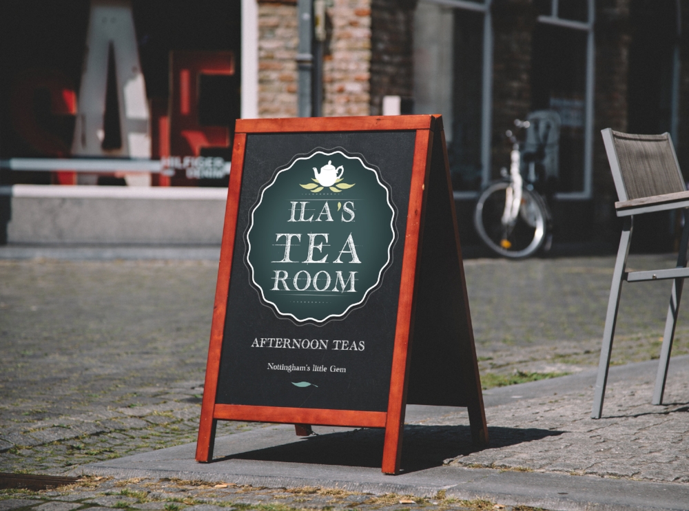
Templates - available from Graphic-burger. Putting the logo & Ila's slogan (personal) onto the chalkboard for effect. See the current chalk-board below to see the difference in execution.

Applied with chalk-paint, how the display looks on Trinity walk.
For the business cards, I followed the theme of having less repetitive elements and included Ila's name (first) to be placed on the front. And the back to include social media pages and contact information.

The front of Ila's contemporary (version) businness card.
Here are the tote-bag ideas I had in mind just to see how the applied branding could appear on bags and accessories. Looking at templates on Graphic-burger (great resource).

Currently I'm in the process of double-checking all the elements to be verified and sent to the printers, I have been receiving additional support via the ACES team at the Nottingham College, and they have been instrumental in helping me manage my schedule and progress.

