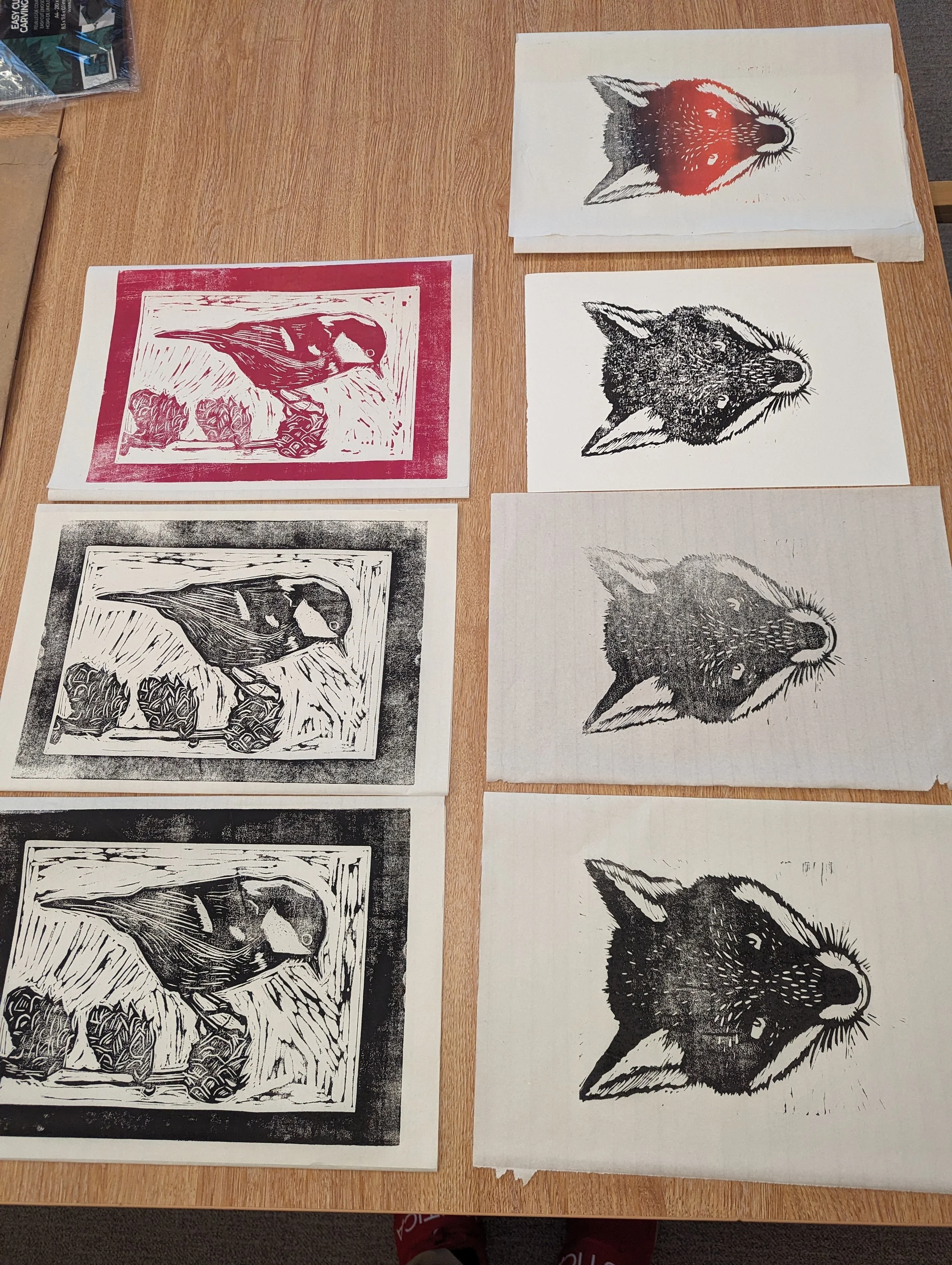
Attenborough Nature Reserve 7th December Linoprinting Workshop

On December the 7th 2023 I had my first class for Lino printing at the Attenborough Nature Reserve. The class consisted of 4 attendees and we managed to produce some great prints and designs. The space for the day was just a bit past the main cafe in the nature reserve, with ample space and seating. Plus the food was excellent and provided some really good scrumptious meals for the day.

I’ll be having future classes at the Attenborough Nature Reserve on the 23rd of March. You can see the Eventbrite for future classes here on their page : Tickets here!

Ila's Tea Room - Branding guidelines

Hello! It's been a few tumultuous weeks of preparation and organizing for our End of Year show this coming June. Currently I have been working into finalizing the brand-guidelines for my final major project. The show will be happening from the 20th to the 23rd of June at Broadway cinema, leaving us the 17th and 18th to set up our display areas accordingly.

For Ila's Tea Room condensing her core brand values and beliefs into a cohesive guideline was important in establishing consistency. In this booklet crucial information regarding Ila's brand is presented, from the details regarding the selected typography/type to the colour swatches in the final logo design. Branding stationery from the A6 flyers, business cards, menu, small scale art prints for principle use. All the nitty gritty elements that go into managing a brand, such as her audience. She expressed keen interest in diversifying her target audience, to attract Nottingham's younger professionals and students for example. As the majority of Nottingham's hospitality/cafe' scene is predominantly comprised of the established corporate chains, understanding Ila's independent competitors was important – such as White Rabbit/Thea Caffe'.

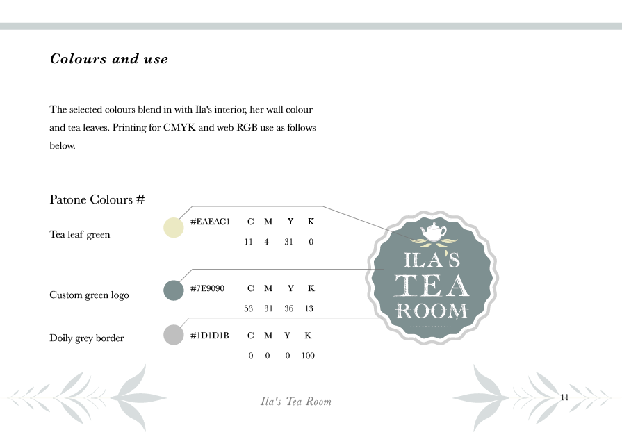
Colours and use page from the brand-guidelines. Outlining the RGB colours/pan-tone colours for printing and digital use.

Colours and use page from the brand-guidelines. Outlining the RGB colours/pan-tone colours for printing and digital use.

After previous visitations to Ila and her tea room, I further understood what kind of regular customers came to visit her. Her current brand 'Ila's Little Tea Shoppe', comments such as the shop's location were a regular concern. Customers would give feedback on specific logistical concerns about how to locate the tea-room, this was an important question and would be resolved by producing a vector map outlining its whereabouts. With a designed map as part of the menu, customers will be able to locate the tea-room with ease.


Example page from the Inspiration I collated in the beginnings of this project, from Charles Rennie Mackintosh's Willow Tearooms to the Yumchaa tea brand.

Example page from the Inspiration I collated in the beginnings of this project, from Charles Rennie Mackintosh's Willow Tearooms to the Yumchaa tea brand.

Contemporary brands - logo inspiration

In Nottingham’s bustling centre there are a variety of quirky independent brands and shops that understand the marketing power of a strong visual identity. Having a clear, yet cohesive and easily recognizable branding this takes root from the kiss analogy in design – the simpler and refined a logo gets to, ultimately it is about capturing the essence of the brand – the company ethos, personality and client especially.


Examining The Specialty Coffee shop just located on 50 Friar Ln, Nottingham NG1 6DQ there is a strong bohemian-vibe to the interior and the graphical elements. Speaking the owner on previous visits, Michelangelo and his partner Lucy they are very passionate about their business and the facilitation of specialist coffees. The bohemian inspired decor interior within the place, creates a relaxing ambience and atmosphere - perfect for those busy commuters and professionals looking for respite from their busy schedules. Just below are a few snippets of the outside shop signage/frontage the whole – the use of white and minimalism consistently used throughout helps establish a calming feel.

Just the outside of the shop. Located on Nottingham, 50 Friar Ln, Nottingham NG1 6DQ.

Just the outside of the shop. Located on Nottingham, 50 Friar Ln, Nottingham NG1 6DQ.

Their instagram feeds where you can see owners Michaelangelo and Lucy showcase earthy sourced imagery promoting their passion for coffee! Customers/regulars also get involved with tagging their watery beverage @thespecialitycoffeeshop. The photos pr…

Their instagram feeds where you can see owners Michaelangelo and Lucy showcase earthy sourced imagery promoting their passion for coffee! Customers/regulars also get involved with tagging their watery beverage @thespecialitycoffeeshop. The photos promote their ethos and story, as seen from their website https://www.thespecialtycoffeeshop.com/story. This is a great addition to their homepage, giving visitors a glimpse into their passion and business.

Moving onto the 200 Degrees logo here for example, you can see minimal use of line work, a focal point on the numerical number alongside subtle textures. Being a minimal design, it is easier to identify and it's appeal is more wide-spread than something more historical. The world is affiliated with Starbucks & Neros/Costa and how, these behemoth chains operate and yet how identifiable their logos are – to create a timeless logo is to strip back to the essence of core themes/ideas associated with the brand. Applying this method ultimately is about extraction and eliminating unnecessary elements or ornamentation, which may detract the reasoning behind the design. For 200 Degrees its the colour, texture, earthy palettes bring association to the coffee/baristas and the quality of craftsmanship that goes into each cup. 

200-logo-696x458.jpg

Gaining further inspiration looking at Yumchaa's Teas and the simplicity of their contemporary logo design. Seen here (below) this remains wholly consistent throughout their online site and social media. Introducing witty design techniques to clearly establish to their audience of what they are all about! Simplicity really is the ultimate sophistication when it comes to producing a contemporary brand.

Yumchaa's official logo icon - for Twitter/instagram and social media.

Yumchaa's official logo icon - for Twitter/instagram and social media.

The head of steam outside signage just opposite the Nottingham Contemporary and Pitcher & Piano. This design similarly with 200 Degrees makes great use of rustic earthy tones, playing on the visual senses back to the industrial past. Having a cog around the main type gives an anchor to the typography and forces the eye to the centre.

The Head of Steam is located on 7 High Pavement, Nottingham NG1 1HF. Website : - http://www.theheadofsteam.co.uk

The Head of Steam is located on 7 High Pavement, Nottingham NG1 1HF. Website : - http://www.theheadofsteam.co.uk

The Typographic Work of Jessica Hische

Hey!


Thanks for sparing the time to check out this little space! This marks my first official blog entry to my website. This place will be where I share my thoughts on the work of established Typographers and Illustrators in the creative industries. I'm currently based at New College Nottingham (NCN) doing my Foundation degree in Graphic Design (Illustration) which i'm currently enjoying - the challenges, learning curves and the importance of social networking!


Over the course of my summer holidays this year, I compiled research into a multitude of designers & illustrators, and one of whom who grabbed my attention was Jessica Hische.


Jessica's contributions within the graphic design realm is extensive, she has a book out titled In Progress which is a sneak-peak into her creative working process. Which is currently on my Amazon wish list this year.

To see her folio of work, you can visit her website here at : http://jessicahische.is/working


Since discovering her work, I was inspired to try my hand at typography and calligraphy which came with varying results. These exercises are a great way of creative problem solving, figuring out how to approach a certain type or font - which takes a steady hand and patience.
 

There must be a few of you out there who like me, do tend to procrastinate and put things off like you do. .You know that feeling, oh I'll do it later at x time, its something we all have to take responsibility of, and learning to forgive yourself m…

There must be a few of you out there who like me, do tend to procrastinate and put things off like you do. .You know that feeling, oh I'll do it later at x time, its something we all have to take responsibility of, and learning to forgive yourself more importantly. All those awesome personal projects, sketches and doodles that we LOVE to do because they make us feel good, but at the same time we still have that assignment by Ted we need to be working on!

Here is an example of some practice calligraphy I came up with last week. I did use a guide reference in illustrating this font, specifically the Gothic style. I've always admired Ye Olde Medieval texts and illuminations, the artistry present in the…

Here is an example of some practice calligraphy I came up with last week. I did use a guide reference in illustrating this font, specifically the Gothic style. I've always admired Ye Olde Medieval texts and illuminations, the artistry present in them and the symbolism. My affinity and appreciation of all things Medieval definitely came from my Mother who is quite the history buff. Just imagine those hundreds of years ago in Medieval Europe. . .monks and scribes having to HAND illustrate several hundred page plus tomes, and bibles for the monarchs and ruling bodies. Sometimes it could take between 6 months to a few years to illustrate a tome or illuminated manuscript.